Show here are some front covers i like and think have some good points about:
For the cover above I like the simplicity
and the detail, which has been put into the drawing of the tree I think this is
a good front cover for younger children as is something they will relate too
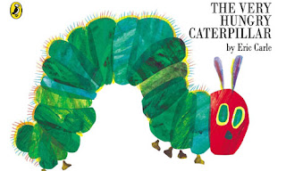
The cover of the hungry caterpillar has a
great use of textures and looks as if the book cover was painted making good
use out of negative space
For the following book I like the use of
solid colour vector drawing the front cover looks engaging and has a number of different
things going on which will keep children focused for a long time
I like the art painting style which has
been used for this book it fits for a book for children
This cover has a good use of illustrations I
also find due to it having also going on children will keep finding new things
every time they look at the cover
The following two books I like the use and detail
in the trees and it gets your attention and makes you focus on the center of
the book where the characters are placed.
For this book I like the pale colours and
the use of vector images which make the book look fun bright and colourful.


No comments:
Post a Comment